Posts

Showing posts from April, 2023

Module 7 – Google Earth

Image
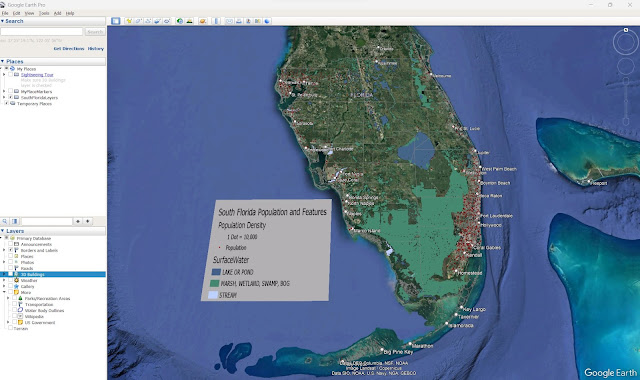
Module 7 for the Cartography class involved using Google Earth Pro to display GIS created in ArcGIS Pro and to create a Google Earth Tour of the data. The first part of the assignment was to create KML files from ArcGIS feature classes using ArcGIS Geoprocessing tool “Layer to KML”. The study area was 23 counties in South Florida and the data layers include population dot density, county boundaries, and surface water. The second part of the assignment was to create a Google Earth tour of the most populated cites in South Florida.  The tour started with an overall view of South Florida showing the GIS Layers and then zooms to the following areas: Miami metropolitan area Downtown Miami Downtown Ft. Lauderdale Tampa Bay Area Downtown St. Petersburg Downtown Tampa                                   Video is 3x speed. Google Earth Pro is a great platform for sharing GIS data and creating virtual tours of your project areas.

Module 6 – Isarithmic Mapping

Image
Module 6 Isarithmic Mapping assignment for the Cartography class was to create a map that showed the annual precipitation data for Washington State. ArcGIS Pro was used to create the map using the provided raster dataset that contains the 30-yr normal yearly precipitatio n for the state of Washington. The precipitation raster dataset was derived using the Parameter-elevation Regressions on Independent Slopes Model (PRISM). The model incorporates surface elevation, coastal proximity, topographic orientation, vertical atmospheric layers, and other factors into the interpolations. It also includes a dense network of climate monitoring stations that cover the United States. The isarithmic map utilizes hypsometric tinting which shades a dataset into a stepping interval of colors where the area between contour lines receives the same color tint. The raster dataset values were first converted to integers and then symbolized based on 10 different classifications ranging from elevation <=

Module 5 – Choropleth Mapping

Image
 Module 5 assignment for the Cartography class was to create a map that showed the 2012 wine consumption for European countries. The map includes a Choropleth map of the population density of each country and a graduated or proportional symbol showing the wine consumption of each country.   ArcGIS pro was used to create the map using the provided European Country polygon shapefile that included attribute data with the country name, population density, and the liter per capita of wine consumption for each country. The map utilized the Europe Albers Equal Area Conic projection since it preserved the area of each country which was needed when creating choropleth maps.  The European Wine Consumption map utilized both Cloropleth map and graduated symbol cartography techniques. Cloropleth maps use different color shades to visualize the different quantitative data. The map uses different shades of green to symbolize the countries where the darker green had higher population density and the

Module 4 – Data Classification

Image
Module 4 assignment for the Cartography class was to compare four different classification methods using the Miami-Dade County 2010 Census data. The assignment was to create 2 separate maps utilizing the same data and classification methods, with the second map normalizing the data based on area. ArcGIS Pro was used to create the maps using the provided 2010 US Census data for Miami-Dade County in a polygon shapefile. The following fields were utilized for creating the maps: ·         PCT_65BV – Percent of population age 65 and older for each census tract ·         AGE_65_UP – Count of population age 65 and older for each census tract ·         SQ_MI – Square miles of each census tract ·         Name10 – Name of each census tract Map 1 utilized the four different data classification methods using the percentage of the population age 65 and older without normalizing the data. Map 2 utilized the four different data classification methods using the population age 65 and older f

Module 3 - Ward 7

Image
Module 3 assignment for the Cartography class was to create a map showing the location of Public Schools in Ward 7, Washington D.C. The assignment focused on the utilization of Gestalt’s Principles of Visual Hierarchy, Figure-ground distinction, Contrast, and balance. The map needed to contain a frame that focused on the Ward 7 area and an inset frame that showed the location of Ward 7 within the Washington D.C. area. ArcGIS Pro was used to create the map using provided data from District of Columbia Open data. A Geodatabase was provided that included a point feature class of all the Public Schools in Washington D.C., the Ward 7 and Washington D.C. boundaries, parks and surface water, and different levels of transportation layers. Visual hierarchy was implemented on the map by using symbology that brings the school locations to the forefront of the map. The reddish hue of the school’s symbols makes them stand out as the most important feature on the map. The reader is then directed t