Module 5 – Choropleth Mapping
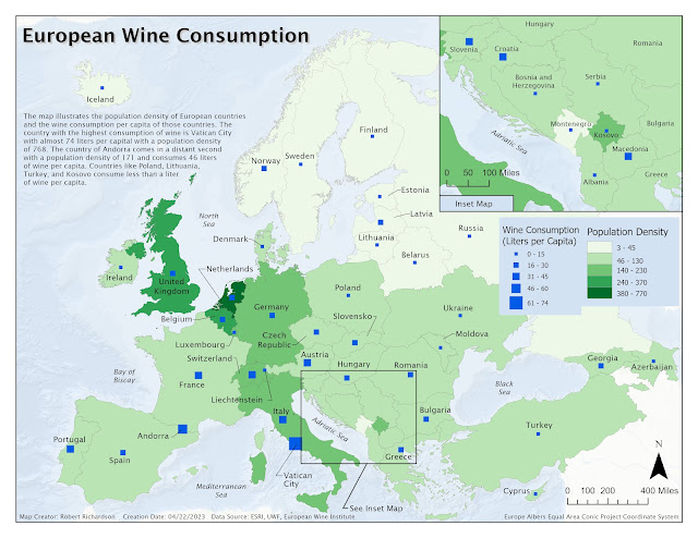
Module 5 assignment for the Cartography class was to create a map that showed the 2012 wine consumption for European countries. The map includes a Choropleth map of the population density of each country and a graduated or proportional symbol showing the wine consumption of each country.
The European Wine Consumption map utilized both Cloropleth map and graduated symbol cartography techniques. Cloropleth maps use different color shades to visualize the different quantitative data. The map uses different shades of green to symbolize the countries where the darker green had higher population density and the lighter green represented lower density. A graduated symbol was used to represent the liters per capita of each country, where the larger square symbol was more consumption, and the smaller symbol was less consumption.
The results show that Vatican City
has one of the highest population densities of 768 and the highest wine
consumption by far, with almost 74 liters per capita.


Comments
Post a Comment