Module 4 – Data Classification
Module 4 assignment for the
Cartography class was to compare four different classification methods using
the Miami-Dade County 2010 Census data. The assignment was to create 2 separate
maps utilizing the same data and classification methods, with the second map normalizing
the data based on area. ArcGIS Pro was used to create the maps using the provided 2010 US
Census data for Miami-Dade County in a polygon
shapefile. The following fields were utilized for creating the maps:
·
PCT_65BV
– Percent of population age 65 and older for each census tract
·
AGE_65_UP
– Count of population age 65 and older for each census tract
·
SQ_MI –
Square miles of each census tract
· Name10 – Name of each census tract
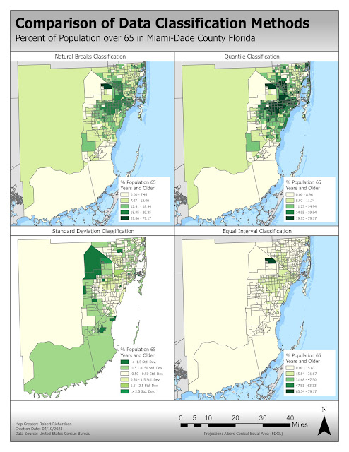
Map 1 utilized the four different data classification methods using the percentage
of the population age 65 and older without normalizing the data.
Equal Interval Classification
Equal interval classification divides the dataset into classes where there is an equal range of values in each class. Class ranges are created by subtracting the maximum value by the minimum value and dividing it by the number of preferred classes. This classification method is best used with data that is evenly distributed. Equal interval classification can be useful in revealing outliers in a dataset.
Quantile Classification
Quantile classification divides the data into classes that contain an equal number of features in each class. The classes are created by sorting the data from lowest to highest and then dividing by the number of preferred classes. This classification method will have no empty classes or classes with too few or too many values. The quantile classification is ideal for ranked data. The disadvantage of this method is that similar values can be placed in different classes and values that are very different can be placed in the same class.
Standard Deviation
Standard deviation classification shows how the data values are related to the mean of the data. Class breaks occur at equal intervals from the mean usually at one, one-half, one-third, or one-fourth the standard deviation. This method does not work well when the data is skewed by very high or low values. This method is used when you are interested in how the data relates to the mean.
Natural Breaks
Natural Break classification
divides the data into classes where there are natural breaks in the data
values. Class breaks are created using the Jenks algorithm that attempts to
keep like values together and maximize the differences between classes. This
method is useful when data values are not evenly distributed and considers
outliers in the data.
My Findings
The Natural Breaks classification using the field percentage
aged 65 and above would be the best choice if you are looking to target the
senior citizen population. Equal interval and standard deviation classification
methods do not work well when there are outliers in the data. Tract 90.40 has
79% senior citizens population, which is a very high value compared to the
other tracts. The quantile classification method considers the outliers but
also includes tracts that are very different.
Normalizing the population counts by the area of each tract
would be the best way to depict the distribution of population for Miami-Dade
County. Normalizing the data based on the area gives a better representation of
where the senior citizens are spread across the entire area of the Miami-data
county. The data is normalized by dividing the total population of senior
citizens in the tract by the area of the tract. The Quantile classification
method looks to be the best option since the class breaks are evenly filled
where each class has the same number of features. The quantile method is
generally good for rank data.


Comments
Post a Comment