Module 1: Map Critique
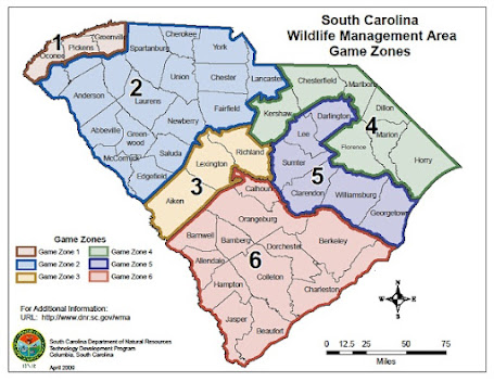
Module 1 of Computer Cartography we were tasked with evaluating and critiquing a well-designed map and a poorly-designed map. We evaluate each using established cartographic design principles that look to determine the substantive and affective objectives of each map, the intended audience, cartographic design, map elements and page layout. I selected the South Carolina Wildlife Management Area Game Zones as the well-designed map, and the U.S.A. Sitcom Map and the poorly-designed map.
Well-Designed Map
The map for the South Carolina Wildlife Management Area Game Zones is a perfect example of a well-designed map since it meets the requirements of the Tufte’s 6 commandments. The map’s intended purpose of showing the game zones is effective with efficient use of map space and use of symbology that stands out and is easily understood. The map is labeled in a way that is easy to read with no additional explanation needed. All the elements on the map are well placed and size with no unnecessary stuff that distracts from the purpose of the map. The layout of the map is balanced and makes good use of the white space that exist due to the odd shape of the state of South Carolina. The map looks very professional and succeeds in its intended purpose of show the game zones for South Carolina Wildlife Management Area.
Poorly-Designed Map
The map of the
United States Sitcom’s is a good example of a poorly-designed map since it does
not meet many of the Tufte’s 6 Commandments. The map does not have substantial
information to relay the intended purpose of the map. The intended purpose of
the map can only be determined by the short title and my own familiarity with the
labels on the map. The labels are ineffectively placed so that it is not
possible to know the exact location of the sitcom, and which state they are
located. The map does not contain unnecessary elements, but it does lack
elements that could help the user better understand the map. There is no legend
on the map to explain the symbology and labeling. The layout of the map is very
cluttered, and the labels are arbitrarily placed around the map.
The map could be
improved by first reducing the size of the title and title header to make more
space. The extent of the map can be increased to fill the width of the page. Use
the actual cities where the sitcoms are filmed as a point on the map with a
single number as a label instead of using the sitcom name as the location. Place
a table at the bottom that list the cities and sitcoms that are associated with
the city. Assign each state with the number of sitcoms and shade the states
based on the number. Finally, add a legend the explain the symbology.


Comments
Post a Comment